Like so many of you gorgeous ladies,
I came to blogland with ZERO knowledge
about how to design my blog.
In addition to that, I had ZERO clue
on what I wanted it to look like.
After several months weeks of contemplation,
in addition to my AWESOME hubby (DL),
I have braved attempting the changes on my own.
I have chosen a color scheme
(gray and mint green with some splashes of pink)
that I think represents me well,
(gray and mint green with some splashes of pink)
that I think represents me well,
plus it goes along with my new little button.
I also made a Featured button because I am going to start featuring some gals more and more.
I also made a Featured button because I am going to start featuring some gals more and more.
I thought it might be nice for me to share with you a bit about how I went through these changes.
There are so many amazing tutorials on how to
create buttons and banners,
but I had a bit of trouble with backgrounds.
Shabbyblogs did have sooo many that I liked, but for some reason my desktop won't open any blog that has their code.
My Mac will though.
This being the case I didn't want to use one of their designs.
So, I just started typing key terms into Google.
Stuff like:
Free Blog Backgrounds
Free Blog Designs
Free Polka Dot Blog Backgrounds.
which is where I acquired my background image.
It came in several colors.
It came with a tutorial, but the design minima is not in my Blogger template choices, so they didn't work.
Back to Google I went with some new key terms:
I eventually came to this SUPER great site.
It has a simple and understandable tutorial
explaining how to alter the design in using the
new Blogger Template Designer.
WAY EASY!!!!!!
All I had to do now was go into the template designer and change the fonts and colors to the ones I wanted.
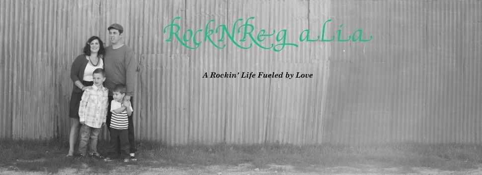
I then created a new banner.
(For awesome banner and button help see Nichelle
at Vintage Wanna Bee)
The final extra touch that I added was a Favicon.
You know that awesome mint green and white icon you see in the address bar.
Maria-Isabel at Agape Love posted about
discovering an amazing tutorial.
Follow this link to Making Life A Bliss
so that you too can ROCK your own Favicon.
So, if you are like me and want something fresh, but not a copy of someone else's blog,
check it out and be brave.
I did have a little glitch where there were
shadows behind my photos.
I didn't want this. So I asked Paige from Pink Lemonade
(She is such a doll)
and she replied back with an answer in a jiffy.
Remember to ask questions.
The lovely ladies of blogland will answer.
I did have a little glitch where there were
shadows behind my photos.
I didn't want this. So I asked Paige from Pink Lemonade
(She is such a doll)
and she replied back with an answer in a jiffy.
Remember to ask questions.
The lovely ladies of blogland will answer.
I am sure I will continue to tweak it.
I still want to mess with the tabs and labels.
I still want to mess with the tabs and labels.


It looks great! Nice work!
ReplyDeleteI love how your favicon turned out, the heart is so cute! Thanks for linking to my tutorial, your website is looking great!
ReplyDeleteKristie @ making life a Bliss